Wallpaper Wednesday - Inspiration
We interrupt this regular Wallpaper Wednesday broadcast to bring you some WALLPAPER INSPIRATION!
Since starting this Wallpaper Wednesday series, I have gotten several questions and comments in my inbox regarding wallpaper feeling too “busy” for a space. And you know what? I 100% agree…sometimes. For some of the patterns I have shared, I think I would go crazy if all 4 walls were covered in it. Therefore, let’s go over a few ways wallpaper can be used without being overwhelming.
ON AN ACCENT WALL
Can surrounding yourself in pattern feel anxiety-inducing? Yes! Can the cost of wallpaper be exorbitant? Absolutely! However, by placing wallpaper on one accent wall, you can draw attention to that wall and either emphasize existing architectural details or instantly add character while not detracting from a space’s inherent beauty.
Credit: Found on kidsinteriors.com
Did you know that babies cannot see color until roughly 4 months old?! While black and white geometric patterns don’t necessarily scream “cutesy”, they can actually be some of the most developmentally appropriate prints to have in a nursery. And if you are really bold, why not paint some of the white spaces in cheery colors as the baby’s vision develops!
Credit: Brian Woodcock
This gold and white floral wallpaper helps bring attention to the architectural details of the space, makes the wall feel larger, and breaks up the white of the walls, floors, and ceiling. The print is sophisticated yet fun and will remain relevant as the girl who lives in the room ages.
Credit: Caroline Sellars - Tidal Interiors
In this beach house bedroom we completed in 2020, the room completely lacked character. With this being the only wall on which a bed could truly work, we decided to add a fun wallpaper to remind guests they are on vacation and to instantly add interest to what was essentially a boring white box.
Credit: Stadshem
If I’m going to be honest, this black and white geometric wallpaper would probably make feel dizzy and disoriented if it was on all of the walls. However, by placing it on this one wall, it breaks up some of the white of the hallway and acts as a great backdrop for the homeowner’s Pop Art. The full length mirror helps keep the space feeling light and breaks up the pattern.
ABOVE BOARD AND BATTEN
Placing wallpaper above board and batten (or wainscoting or a chair rail or…) is an easy way to add visual interest to a room, break up the pattern of the wallpaper, and draw attention to both the molding and the wallpaper. Another great bonus of placing the wallpaper only above the board and batten? It helps keep the cost down!
Photo: Caroline Sellars - TIdal Interiors
After seeing the wallpaper we used in the beach house project shown above, my husband actually requested we use the same wallpaper in our own dining room. While I was completely caught off guard and speechless, I knew I needed to act fast before he changed his mind. By placing this vibrant pattern above our board and batten, we were able to add a great pop of color, pattern, and visual interest to our dining room.
Credit: Delineateyourdwelling
In this bathroom, the homeowners chose a bold pattern and matched the paint color of the board and batten to the color in the wallpaper. This makes the board and batten feel modern and keeps the room cohesive and not overwhelming.
Credit: Young House Love
Remember in the 80’s and 90’s when everyone jumped on the wallpaper border trend? This room from Young House Love combines the concept of the wallpaper border with board and batten in the best possible way. So much character from the board and batten and historic door with just the right amount of whimsy from the wallpaper!
Credit: Pottery Barn
This bathroom feels sophisticated without feeling stuffy. By matching the board and batten to the light blue found in the wallpaper, the room feels fresh while still feeling formal.
ON THE CEILING
By now you have probably heard of the concept of the “5th wall”. If not, it is the idea that the ceiling should not be an afterthought, rather another surface to be included in the overall design of the room. In some cases that means painting the ceiling the same color as the walls in order to keep the room feeling cohesive, often making the room feel larger. In other cases, adding wallpaper to the ceiling can add an unexpected splash of color or pattern without feeling overwhelming or competing with other design elements in the room.
Credit: Photo by Lauren Logan, Design by Maureen Stevens Design
The wallpaper on the ceiling in this breakfast nook keeps the space feeling light and airy and helps bring the view of the garden into the room for an almost al fresco dining feel.
Credit: Photo by Michael Hunter, Design by Laura U
The rainbow geometric pattern of this wallpaper is so fun and edgy and gives great balance to the white walls and green bed. The space feels clean and modern while not feeling overwhelmingly colorful.
Credit: Design by Skapa Design
You know I love this wallpaper by Hygge & West and to have it on the ceiling above a child’s bed feels so whimsical and childlike while not being too cutesy. I can just imagine lying on this bed as a child daydreaming about being on adventures in the great wide open. So playful and fun!
Credit: Crystal Sinclair Designs
As I stated earlier, this black and white geometric pattern is actually totally developmentally appropriate to have on the ceiling of a nursery. With a baby lying on its back in the crib, the geometric pattern would be easy for them to see and help them engage with their environment.
IN A CLOSET
Wallpaper comes in a wide range of styles but also in a variety of prices. An easy way to incorporate your favorite pattern without breaking the bank? Wallpaper a closet! It turns a boring space into something a little more exciting and is definitely more budget-friendly.
Credit: House of Hipsters
What a fun and unexpected pop of color to welcome guests! This wallpaper in the coat closet is fresh and not overhwhelming and such a fun surprise when you open the closet door!
Credit: Diana Elizabeth blog
I love how this geometric print and the gold light fixture balance each other and elevate a typically pretty boring space. BUT what I really love is that the wallpaper perfectly camouflages the electrical panel on this wall! Seriously - look again! Click on the link in the caption to see the before and after. Pretty amazing!
Credit: Sara Tramp
The bold floral wallpaper and painted ceiling in this walk-in closet make the space feel like a dressing room. And while the closet system is nice and helps give that glam vibe, it can be duplicated with some simple hacks and standard building materials. Moral of the story? Having a spacious, organized closet can instantly go from builder-grade to Hollywood with the right wallpaper!
Credit: Pamela Black and Don Love
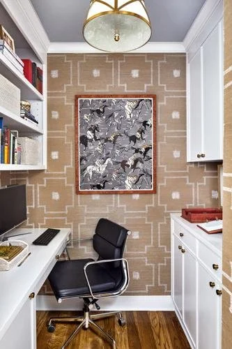
With so many people working from home these days, many are looking for a way to carve out a dedicated work space that can be closed off from the rest of the house both for privacy reasons and just to give a sense that the work day is completed. Enter the “cloffice”. It’s a closet that has been turned into an office…and sometimes functions as both. As you can see in this photo, this space is quite small but the cabinetry, light fixture, and high-end wallpaper make the space feel more upscale and inviting than a cubicle or the dining room table.
IN A NICHE
Niches are often unavoidable. Depending on the actual structural needs, many homes end up with spaces that, well, don’t really make sense. Sometimes a niche is created with a certain purpose in mind (ever seen a house from the 40’s-60’s that had a built-in telephone niche?). Whether intentional or a byproduct, a niche can be a lot more fun with a little wallpaper!
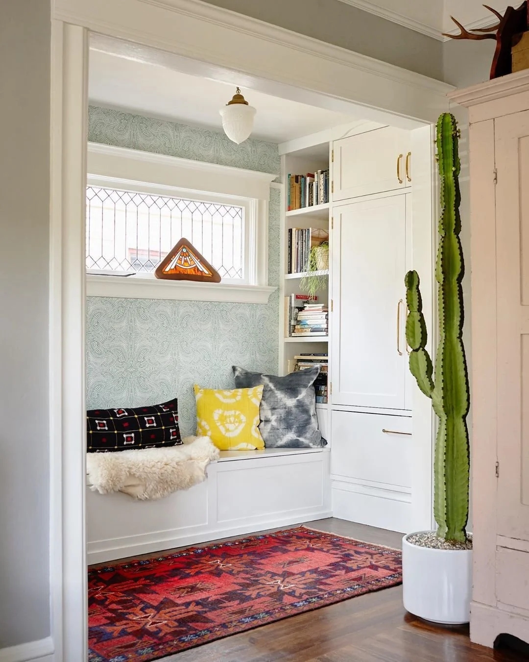
Credit: @ramblinrod
The wallpaper in this niche helps elevate this area and makes it feel like its own room. By adding the wallpaper, the built-in bench becomes a destination rather than an afterthought.
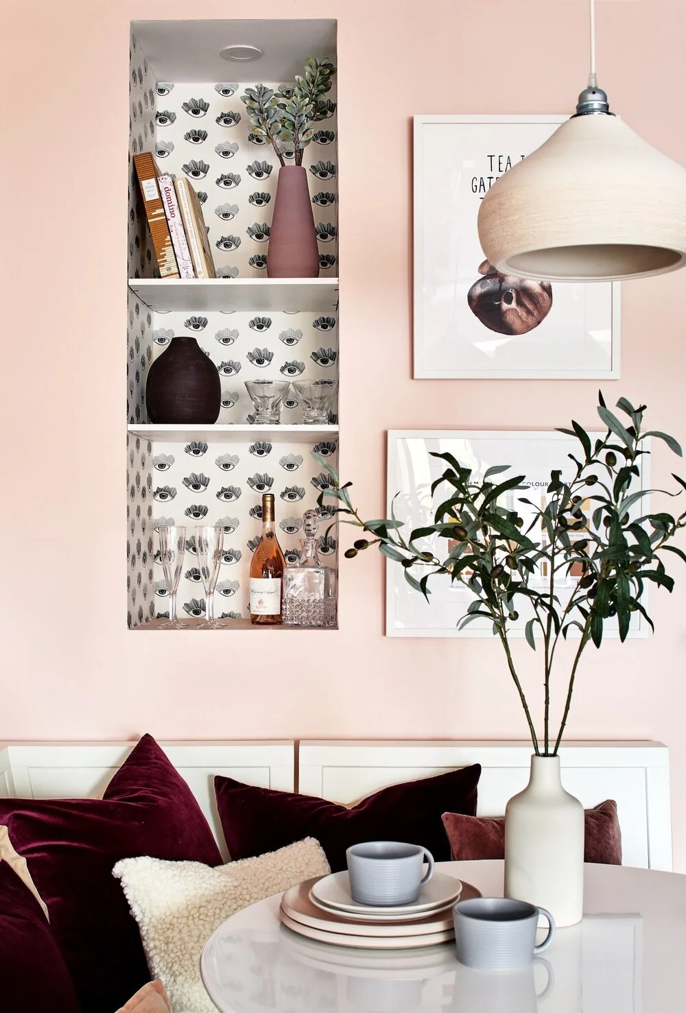
Credit: Zoe Feldman Design
Clearly someone who has blush walls with burgundy velvet pillows is not afraid of making bold choices (and I fully support that!) so having this contrasting eye wallpaper adds to the edginess factor of the space and makes the niche feel like even more of a design feature than if they had painted it the same color as the walls.
Credit: Garrison Hullinger Interior Design
I often have clients who purchase a home with a nice and ask “what am I supposed to do with this?” It’s a valid question. Sometimes the niche is a strange size and can’t truly be utilized for storage or seating. That can be a great time to draw attention to the space by adding wallpaper, lighting, trim, and a beautiful piece of furniture to make the space feel intentional and purposeful rather than try to make the niche disappear by painting it the same color as the walls which makes it feel like more of an accident.
Credit: Caroline Sellars - Tidal Interiors
In this space, the homeowner had a wet bar adjacent to an area that was undergoing renovation. While they didn’t want to lose the space, they didn’t want to allocate major funds for an upgrade of such a small space. The solution? Peel-and-stick wallpaper, open shelving, updated hardware, and painting the cheap laminate countertops. The niche now has a speakeasy vibe and was accomplished on a serious budget!
IN A BUILT-IN/BOOKSHELF
So many homes have built-ins which can often feel very boring and builder-grade. Many homeowners struggle to find beautiful objects to place on their shelves to make a space feel stylish and elegant while also feeling personal. However, by adding wallpaper to the back, these architectural features can instantly feel elevated and reflect the personality of the homeowner.
Credit: Annette Tatum
The gold and natural tones of the grasscloth wallpaper in these built-ins connects the space to the natural world around it and gives a coastal feel. The space feels sophisticated and classy and provides a neutral backdrop for the items the homeowner wants to display.
Credit: EJ Interiors
While this wallpaper may seem busy in other settings, against the bold green of the rest of the room it is subtle yet playful. In a room clearly designed for fun and creativity, it is a perfect accent on these built-ins!
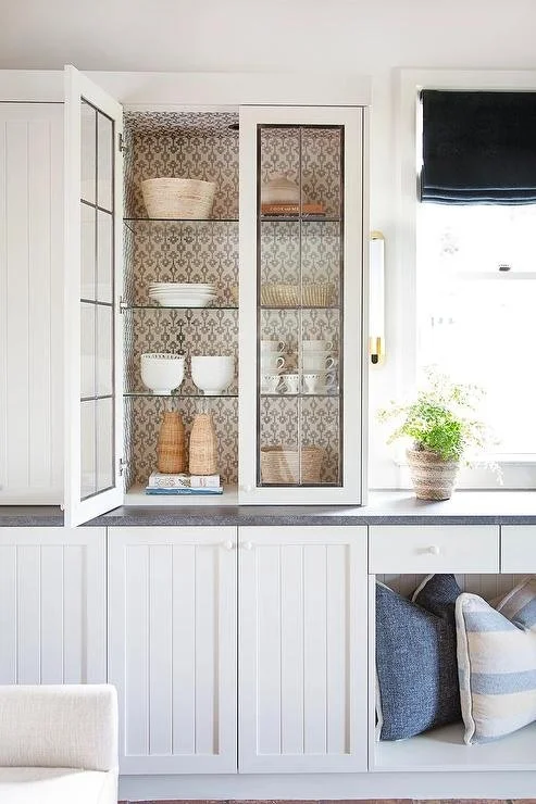
Credit: Brooke Wagner Design
The calming palette and tile-like pattern of this wallpaper is the perfect backdrop for displaying a collection of white and natural dishwasher in this glass-front cabinet.
Credit: Jenkins Interiors
This is a mudroom that doesn’t take itself too seriously! With the combination of the fun wallpaper and patterned cushions, maybe even MY family would want to put their (i.e. our) things in their proper place!
ON A PIECE OF FURNITURE
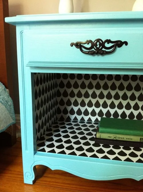
Peel-and-stick wallpaper is perfect for furniture! Contact paper or shelf liner has been placed in cabinets and drawers for ages. Now you don’t have to use the faux wood or old-lady-floral patterns typically sold at big box stores. You can cover the furniture inside and out with whatever speaks to you!
Source: Ikeahackers.net
Now this is a seriously vibrant way to add color and whimsy to a child’s room! By adding a bold wallpaper to a simple piece of flat-front furniture and you instantly put the “fun” in functional!
Credit: cuckoo4design
YES! That IS wallpaper! Can you believe it? I’m honestly in awe! I attempted a grasscloth Serena and Lily dupe a few months back and let me tell you, this is lightyears better than mine. I would buy that. In an instant!
Credit: Caitlin Topham
What a fun way to update a piece of furniture you already own or are able to thrift! If you are like me, you have lots of inherited pieces of furniture that aren’t necessarily your style. A fresh coat of paint and some fun wallpaper and these types of pieces go from hand-me-down to pick-me-up!
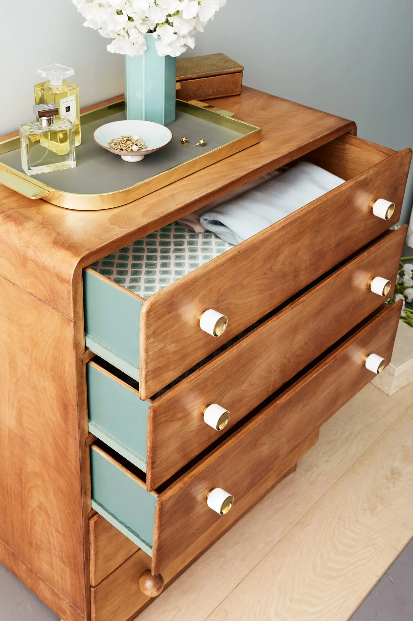
Credit: Photo: Raymond Hom for Martha Stewart
This is such a beautiful and tasteful way to update a vintage pieces. People have added contact paper or shelf liners to their drawers for years however, adding a pattern that you truly love can look even better! And if you like it that much INSIDE your drawers, why not add it to the sides of your drawers as well?!
HONORABLE MENTIONS
Obviously there are TONS of ways to add wallpaper to your home without covering every wall in wallpaper. Here are a few other ways:
AS A BACKSPLASH
Credit: Anita Yokota
FRAMED WALLPAPER PANEL(S)
Credit: Shining on Design
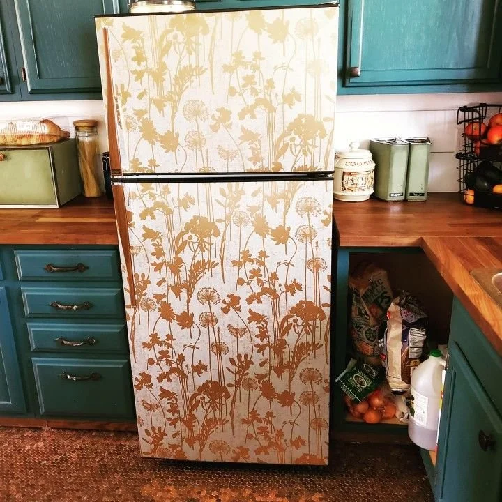
ON APPLIANCES
Credit: TBD
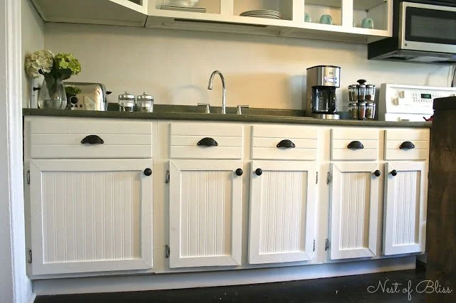
ON CABINETS
Credit: Nest of Bliss
and of course…
ON A DRYING RACK
Ok, are you convinced yet? Which easy way are you going to add some wallpaper? Let us know in the comments!
Feeling inspired to give wallpaper a try? Go back to the previous blog posts to look at some of my recommendations for bathroom wallpaper and nursery wallpaper! And stay tuned because next week I really am going to bring you some Primary Bedroom wallpapers I think you will really like!


